Medusa - Injectable Medicines Guide
NHS
Anyone that injects any medication within the NHS uses Medusa to make sure they are inejcting the right amount, but their system was 20 years old and needed to be accessible on different devices.
I embarked on a project to make accessing these monographs more intuitive, the design mobile friendly and modern, yet still recognisable to the workflows of thousands of nurses across the country, with a revamp for those updating these crucial monographs.
Read about Medusa →
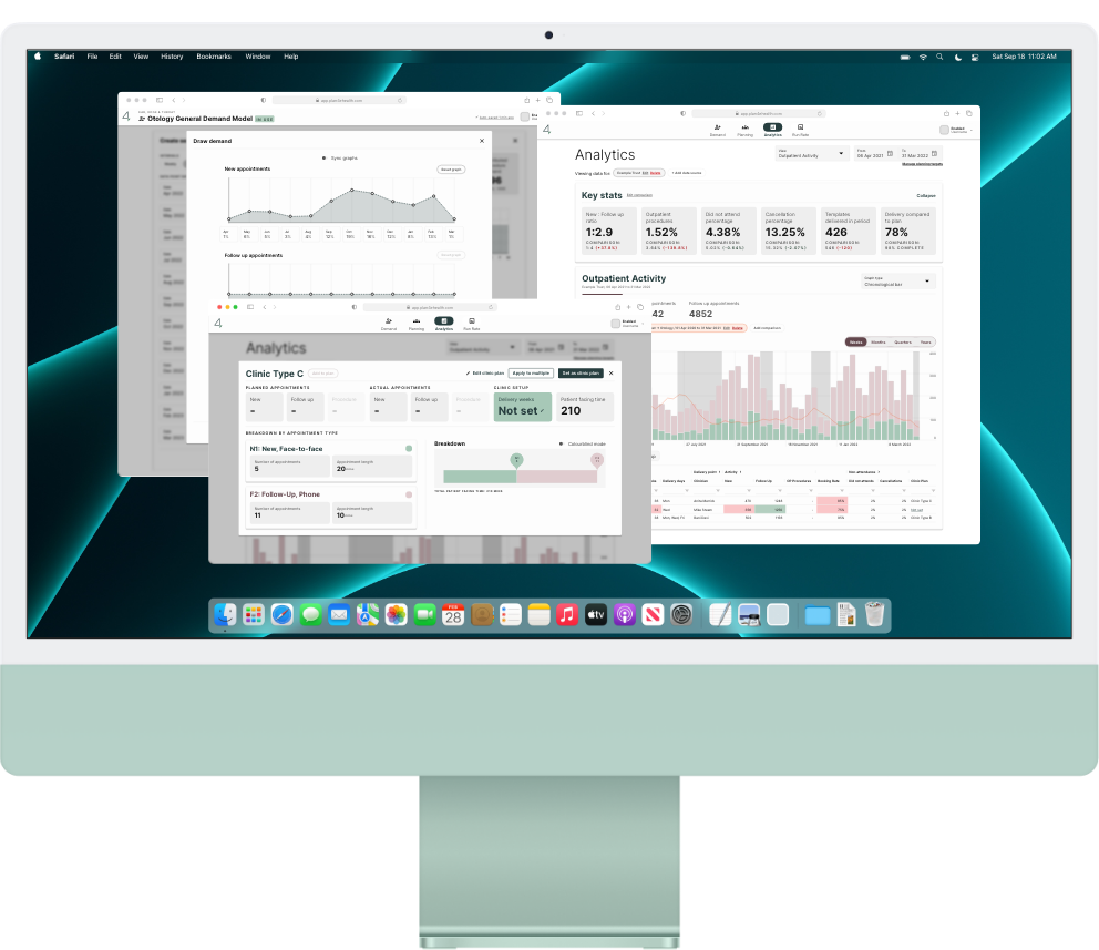
NHS Demand, Planning and Analytics tool
Plan4 eHealth
Before, but particularly after COVID, the NHS has suffered from long waitlists, and planning that varied massively from specialtiy to specialtiy, some basically being 'napkin maths'.
This made estimating and planning for actual activity almost impossible — which is where Plan4 came in. Planning clinics and theatre activity became a visual an intuitive task, part of a workflow, and easier to visualise whether plans met targets, and the activity that was happening within a Trust.
Read about Plan4 →
Crisis Simulator
Polpeo
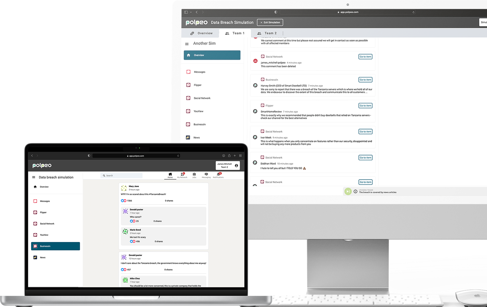
Polpeo’s big idea was a true-to-life digital simulation, populated with realistic scenarios that would immerse their clients in an engaging way. It would enable clients to develop crisis skills in a private and safe environment, learning powerful lessons and gaining invaluable insights that would help protect their brand in the real world.
Creating a simulator that allowed users to join and participate in simulations, and Polpeo staff to administrate and facilitate the simulation required extensive user research and testing to ensure it worked well.
Read about Polpeo →
Marketing Site
Asda Money
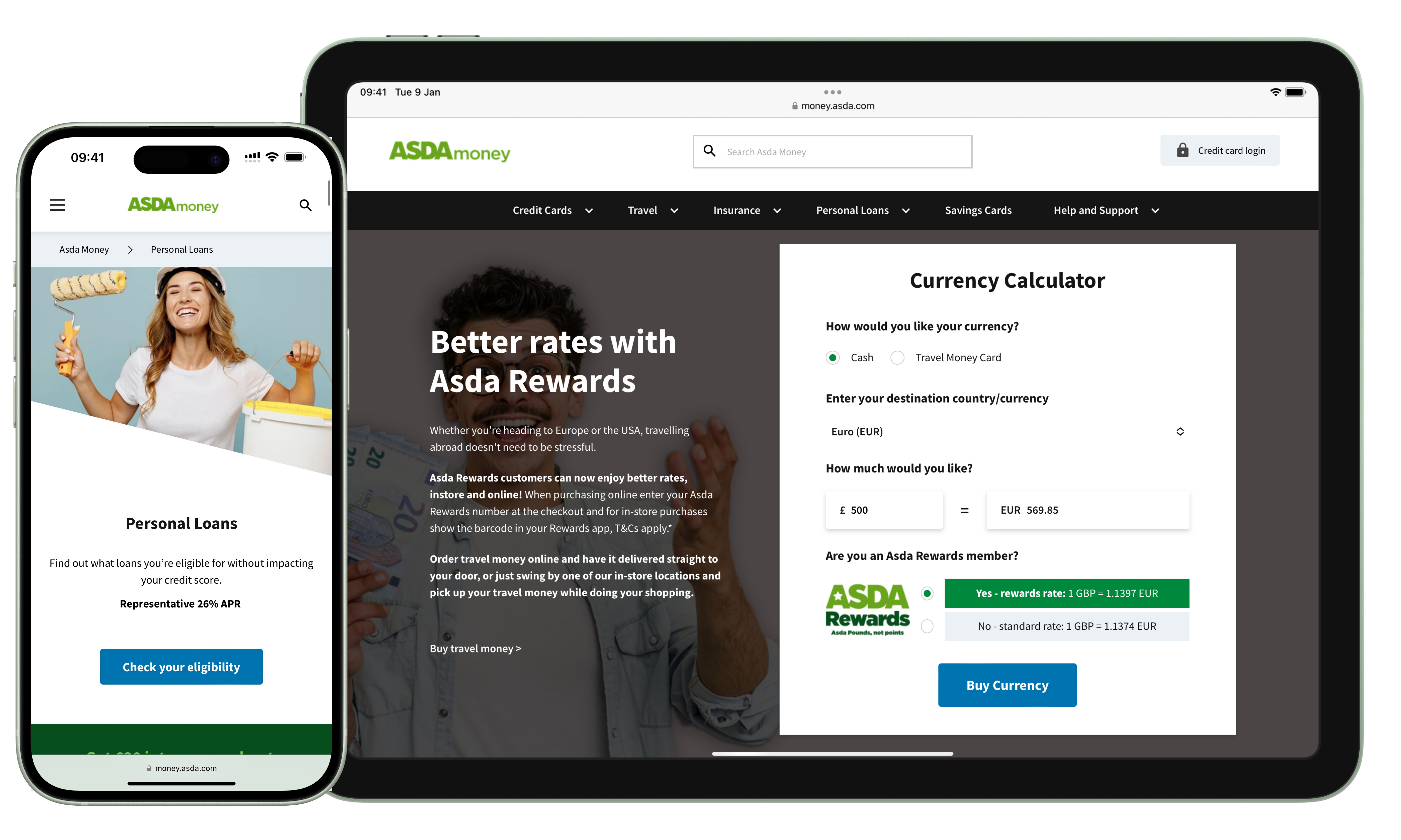
Asda Money needed a website that reflected their brand, but mostly provided concise and clear information to their users. They provided multiple services under the Asda Money name, but each had a different provider. This led to multiple issues, ranging from careful control around the marketing of these services, to disjointed user journeys as users had to complete their purchase on a separate website (run by the provider).
Careful consideration was required in the refresh, with an emphasis on clarity and transparency. Alongside its visual refresh, standardisation of user journeys using a pattern library ensured synchronisation of both purchases and servicing of accounts across all services, creating a cohesive experience for users. Clear indication and explanation for transitions to provider sites ensured trust in the Asda Money brand, whilst integration of interactive widgets enabled users to discover potential costs without entering their details.

I have more that I haven't made thumbnails and descriptions for…
They are coming I promise! :)