Background
Every single medication injected in the NHS is documented in a single system. It allows nurses, anaesthetists, or anyone else who needs to administer or monitor the injection of medication to access a single source of truth to check details and guidance about:
- The different names the drug might have (including brand names),
- The different ways to prepare the drug,
- How to administer and flush the drug,
- Any adverse effects,
- Compatibility with other drugs.
These details are contained within monographs for each of the drugs and were accessed through a specific installation, with customisations for each hospital. This also provided details on any shortages affecting the hospital or the NHS, and any recommended guidance on alternatives.
Medusa funds itself through each Trust paying for access. Trusts may have different arrangements with Medusa, where they pay less or none if they agree to maintain some monographs. All this data was managed by a single person who tracked it in a large spreadsheet, external to the system. They then had to manually chase each responsible party, which was very labour-intensive.
There are also variations between Trusts and hospitals regarding what is displayed in their system. Some Trusts remove monographs completely, while others modify the monographs with their own guidance. Others utilised Medusa to show different messages above monographs to provide details on status.
The system was built over 20 years ago and looked dated. Furthermore, it needed to be migrated from a previous installation.
Definition
We were keen to ensure that we developed a system that would be a meaningful improvement for users. Therefore, we conducted in-person user research. We visited Leeds General Infirmary, where one of the nurses in charge of ensuring that monographs were used effectively took us around. We visited different wards and observed the following:
- IT within the hospital was severely lacking, with many laptops or computers not working or having to be shared (one ward, in particular, had only one system on which they all accessed Medusa, taking turns to use it). Furthermore, any initiatives where iPads had been introduced had to be carefully monitored due to concerns about theft.
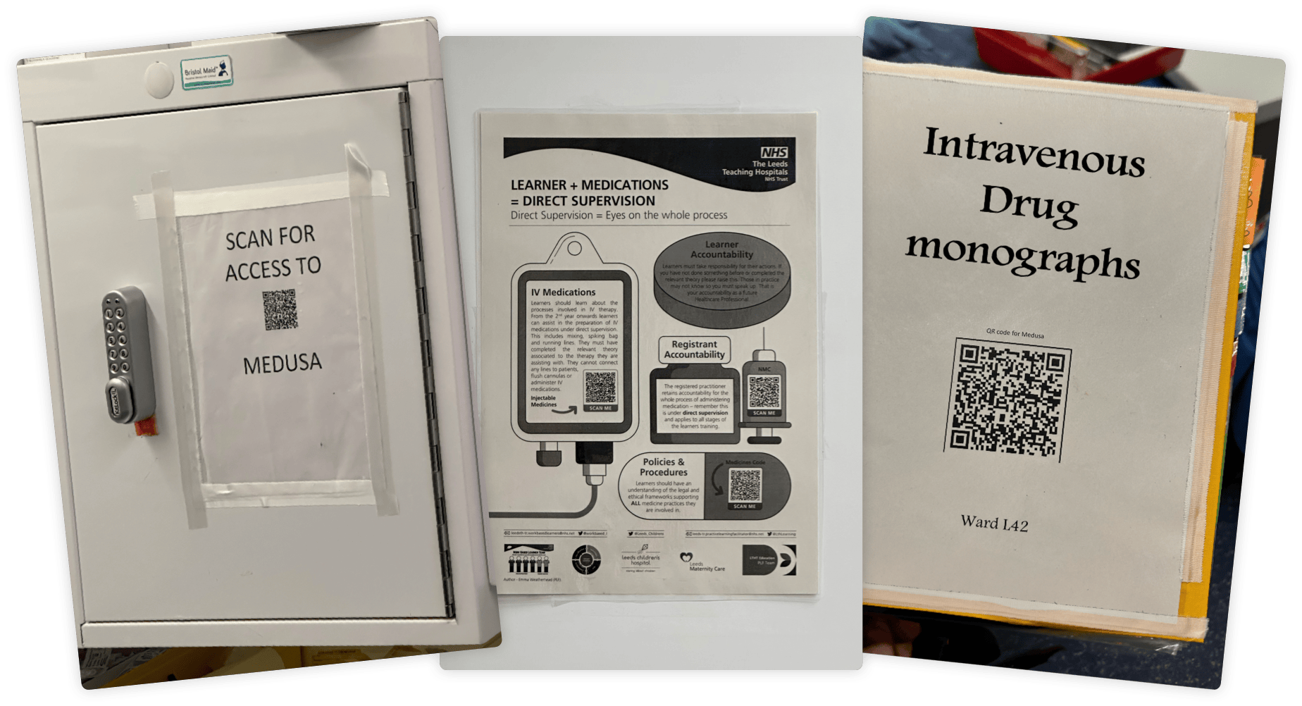
- Many wards resorted to printing off versions of Medusa for use on the ward, as it allowed quicker access than waiting for a computer. This meant that information could become out of date.
- Only some of the wards were aware that they could access Medusa on their phones if required. Those that had used it before had received complaints from patients who thought staff were checking their phones instead of working.
- One nurse's initiative had led to the creation of a QR code on one ward, utilising a feature in the current system that passed on login details. This allowed nurses to scan the code and quickly access their version of Medusa on any device.
- Signal and internet access varied within the hospital. Wifi was supposed to be standard and was being rolled out, but it was not yet fully implemented. This was the main reason monographs were printed off, to ensure there was a hard copy backup.
- Navigation within the system was second nature to experienced users, but the UI was small on mobile or tablet devices and required extensive zooming and scrolling. Users had to know how to navigate certain routes in the sidebar to filter out unwanted monographs (routes such as intravenous or intramuscular).
We also conducted in-depth stakeholder interviews with the team that had maintained Medusa for all these years. We discussed the system’s different capabilities, the manual tasks they had to perform, and how they envisaged the system evolving in the future.
Analysis
We wanted the new system to encompass the different needs of each stakeholder. To achieve this, we started by considering the system’s information architecture. Although, at present, there was only a distinction between adult and paediatric monographs for intravenous drugs, we wanted to ensure that the system was capable of supporting more routes and patient groups (such as obstetric care for pregnant individuals) in the future.
We also sought to streamline the user’s choice of route and patient group, so we designed a clear form that required discrete and intentional interactions from users, ensuring clarity on which monographs they were accessing.
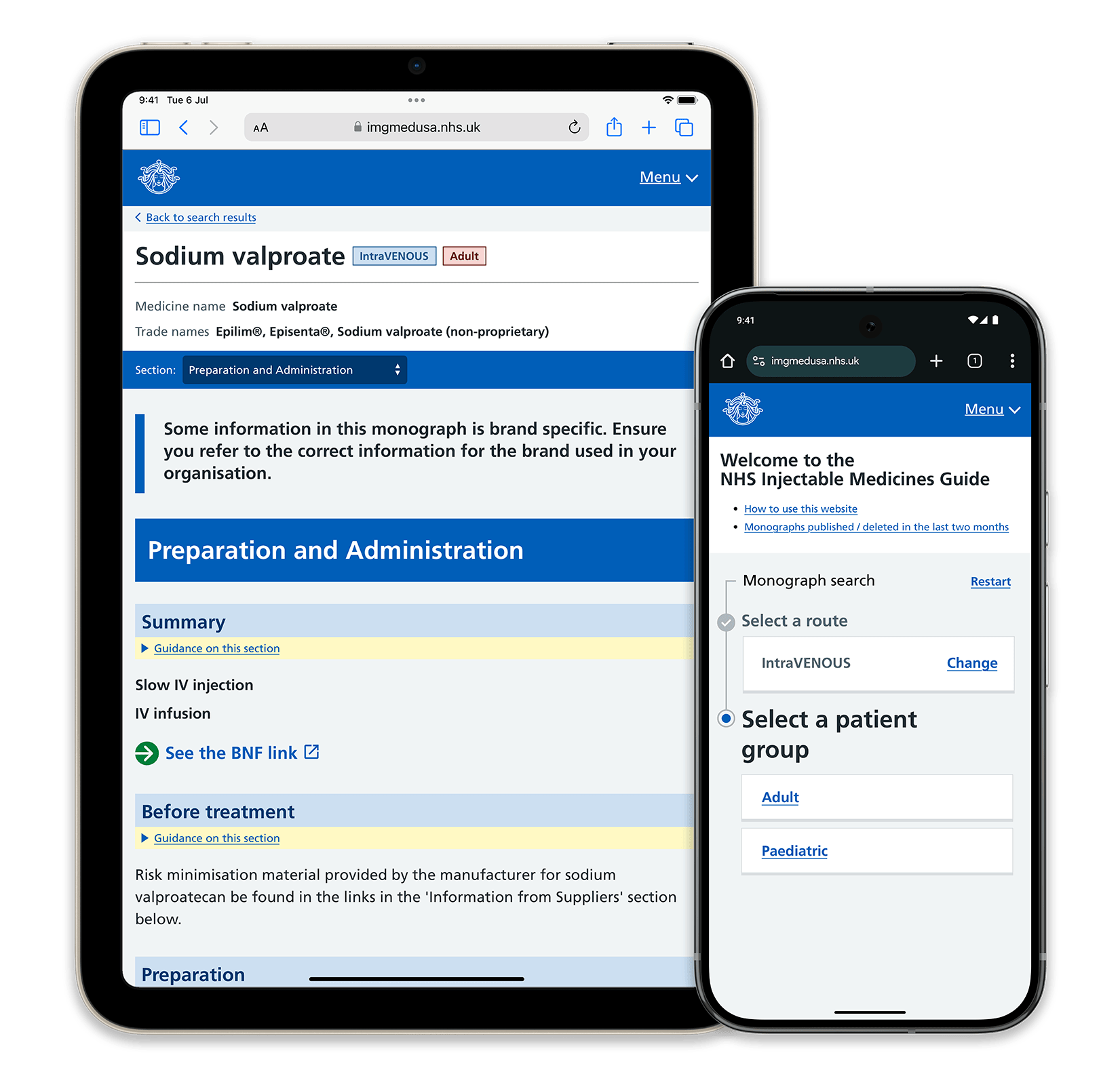
We identified that users often entered part-way through these routes, due to time pressures or sharing devices. This posed issues, especially with the different requirements for adult and paediatric dosages. To make this distinction apparent, we employed a sticky header, clearly identifying the monograph name and tags indicating the route and patient group. These tags were colour-coded for quick recognition and were designed with accessibility in mind.
If a link was shared for a monograph, we did not take the user directly to the monograph but instead asked them to specify the route and patient group. Although this added a few extra steps, the intentionality required reduced the risk of mistakes.
For system management, we ensured that all current functions, such as managing external spreadsheets, could be done within the new system. This included management for the Medusa team, individual Trusts’ settings, and monograph maintenance. The interface provided deadlines and task visibility to reduce late work and allowed easy management of monographs and supplementary information.
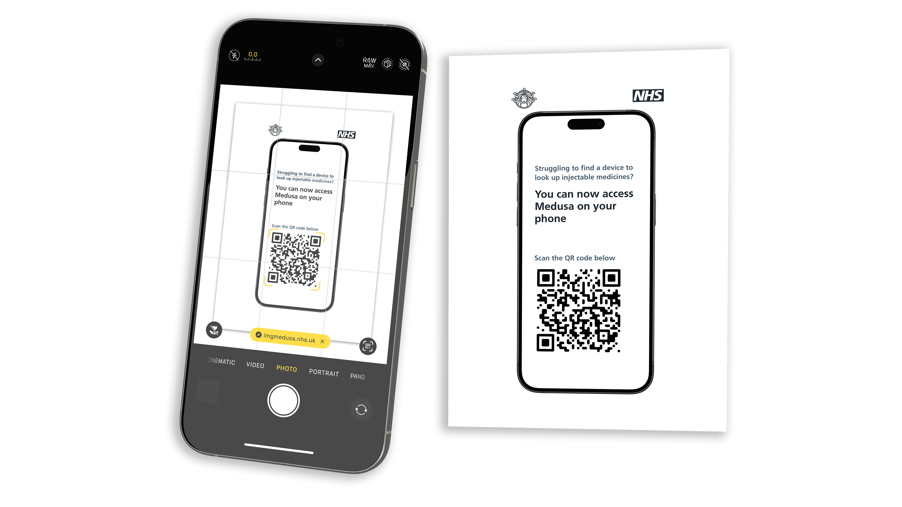
Additionally, recognising the use of personal phones and devices in accessing monographs, we implemented an official method of creating posters with QR codes linked to specific accounts. These QR codes enabled quick access to the correct URL and automatically logged the user in.
Artefacts
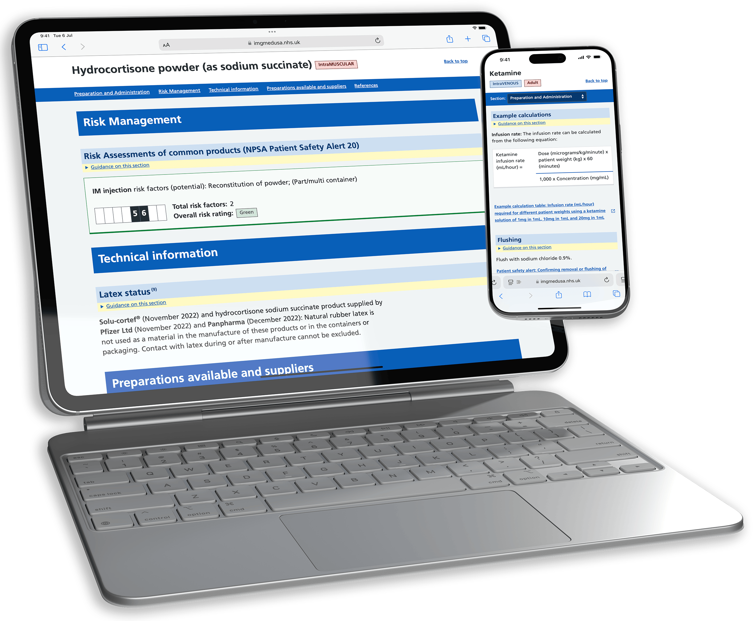
The Medusa team was understandably heavily involved in the early stages. Since this was a refresh of an NHS product, we followed the NHS Design System as closely as possible, leveraging its established design patterns and styling for usability and accessibility. Although the Medusa team was initially hesitant, we mocked up multiple high-fidelity designs to demonstrate how it would work.
The current NHS Design System does not accommodate some of the more complex interactions we required, as it is primarily designed for simpler journeys. We researched other NHS systems and designed new components that aligned with the existing system when necessary.
For example, we customised dividers within monographs, using full-width backgrounds instead of relying on size and weight, because users were often scanning for specific sections rather than reading everything. These full-width blocks gave clear visual cues, and after experimenting with other indicators, we determined that this method was the least distracting.
We also redesigned the monograph layout, employing a secondary navigation bar for quick access to important sections. On mobile, this adapted into a dropdown menu.
Specific components like the Risk Assessment and Calculator blocks were carefully designed. The Risk Assessment block provided a clear, accessible overview of the risks related to a medication. The Calculator block allowed users to input details for dosage calculations, displaying both the calculation and the input details to minimise errors.
Journey
This project felt particularly significant to me. The system required clarity, and errors could have life-or-death consequences. While we built upon the NHS Design System, we iterated and created our own patterns based on requirements, ensuring clarity and usability throughout.
We had to adjust our scope after the discovery phase, as additional but crucial features were identified. Working closely with the Medusa team and our developers at Isotoma allowed for rapid and intentional iteration, ensuring we delivered a product that met all expectations while staying on time.
The user research baseline ran throughout the project, enabling the creation of a system that reduces error, increases efficiency, and ensures accountability for monograph maintenance.
Outcome
The Injectable Medicines Guide, Medusa, is set to go live across the UK imminently. It updates an old, but essential system, ensuring rapid, accurate usage across any device. Effective discovery, design and collaboration ensured the delivery of a system that will continue to serve the NHS for years to come.
We will continue to iterate on the system, using real user feedback and analytics, ensuring that it continues to deliver an optimal experience for its users, if and when their requirements change, ensuring we are doing our part to equip practitioners with a tool to serve patients across the country and beyond.
You can read more about it on the Isotoma website here
Now check out...
Isotoma
NHS Demand, Planning and Analytics tool
Plan4 eHealth
Before, but particularly after COVID, the NHS has suffered from long waitlists, and planning that varied massively from specialtiy to specialtiy, some basically being 'napkin maths'.
This made estimating and planning for actual activity almost impossible — which is where Plan4 came in. Planning clinics and theatre activity became a visual an intuitive task, part of a workflow, and easier to visualise whether plans met targets, and the activity that was happening within a Trust.
Read about Plan4 →